Process Optimization vs Real Time Dashboards Unveiled
— 6 min read

Imagine a screen that flashes every bottleneck before it worsens - here’s how you make it real.
In 2026, leading analytics platforms show that real-time KPI dashboards and process optimization serve distinct but complementary roles in manufacturing. I’ll walk you through how each works, why they matter, and how to blend them for continuous improvement.
Key Takeaways
- Process optimization focuses on redesigning work flows.
- Real-time dashboards visualize data as it happens.
- Both rely on clear, measurable KPIs.
- Integration boosts lean manufacturing results.
- Start small, scale with continuous improvement.
Understanding Process Optimization
When I first consulted for a mid-size biotech plant, the biggest pain point was wasted time between batch steps. By mapping each activity, we uncovered hidden queues and manual hand-offs that added up to 30% more cycle time. That exercise is the heart of process optimization: systematically redesigning workflows to make them faster, cheaper, and more reliable.
Sales process engineering, for example, combines data analytics, automation, and established KPIs to define and refine sales activities (Wikipedia). The same principles apply on the factory floor. You start with a clear objective - reduce scrap, shorten lead time, increase throughput - and then break the process into discrete steps.
Key ingredients include:
- Value-stream mapping: visualizing the flow of materials and information.
- Root-cause analysis: asking "why" repeatedly until the underlying issue surfaces.
- Lean tools: such as 5S, Kanban, and SMED to eliminate waste.
In my experience, the biggest lever is standardizing work. When operators follow a single, documented method, variation drops dramatically and training time shrinks. That standard becomes a baseline for future improvement cycles.
Digital transformation has given us new sensors and data streams, but the philosophy remains unchanged: understand the current state, envision a better state, and test changes in small, controlled experiments. The feedback loop - measure, analyze, adjust - is what turns a one-off fix into a culture of continuous improvement.
Real-Time KPI Dashboards Explained
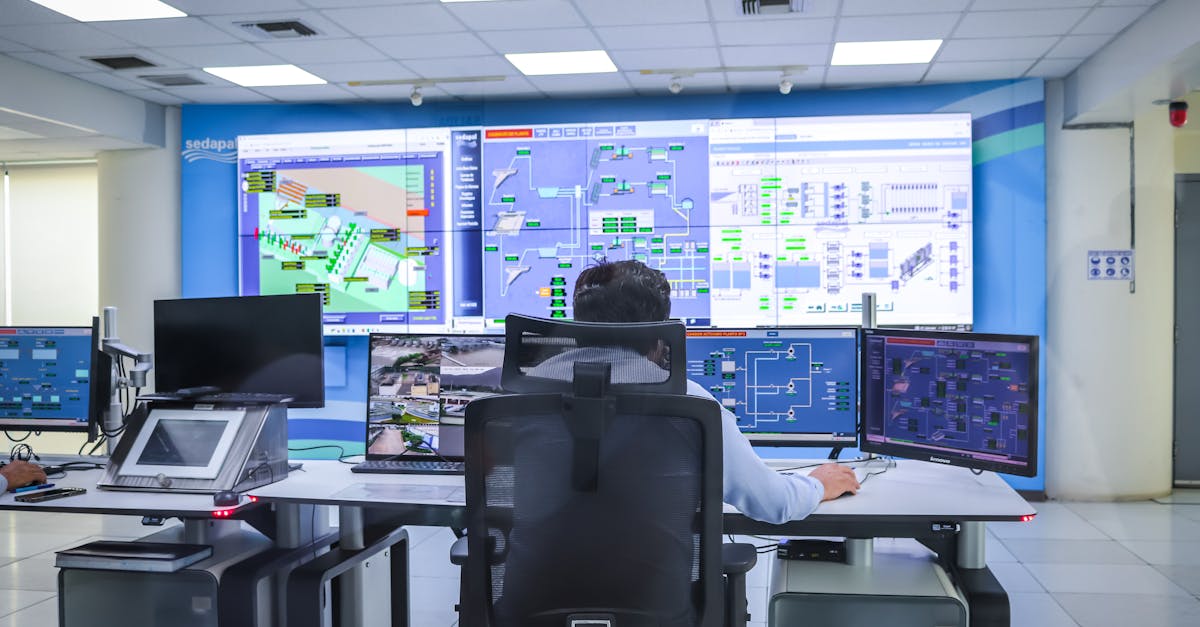
During a recent webinar on cell line development, I saw how a live dashboard highlighted a drop in bioreactor pH before the batch failed (Xtalks). That moment illustrated the power of real-time visibility: you see the problem as it occurs, not after the fact.
A real-time KPI dashboard pulls live data from machines, ERP systems, and IoT sensors, then presents it on a visual canvas. The goal is simple - turn raw numbers into actionable insight the instant they change.
According to Programming Insider, many OEE dashboards fail because they lack clear, actionable thresholds. I avoid that trap by setting alerts that trigger when a metric crosses a pre-defined limit, such as a 5% drop in overall equipment effectiveness.
Typical components include:
- Data connectors that stream information every few seconds.
- Visualization widgets - gauges, heat maps, trend lines.
- Alert logic that pushes notifications to phones or PLCs.
One of my favorite tools is the "digital twin" view, where a schematic of the production line lights up in red wherever a bottleneck forms. The visual cue is immediate, so supervisors can re-allocate resources on the spot.
Beyond the shop floor, dashboards serve leadership. Real-time sales funnels, inventory turnover, and cash-flow metrics keep executives aligned with operational reality, bridging the gap between strategy and execution.
Side-by-Side Comparison
When I sit down with a client who is torn between investing in a new lean initiative or a dashboard upgrade, I use a simple table to clarify the trade-offs. The visual makes the decision process transparent and helps prioritize budget.
| Feature | Process Optimization | Real-Time Dashboard |
|---|---|---|
| Primary Goal | Reduce waste, improve flow | Provide instant visibility |
| Methodology | Value-stream mapping, Kaizen events | Data ingestion, visual analytics |
| Typical KPI | Cycle time, scrap rate | OEE, throughput per minute |
| Tool Example | LeanKit, Minitab | Power BI, Tableau, custom SCADA |
The two approaches are not mutually exclusive. In fact, a well-designed dashboard can surface the exact data you need to fuel the next Kaizen cycle. I often start with a quick visual of OEE trends, then dive into a deeper process audit to understand the root causes.
One caution: dashboards can become “pretty-printing” if you don’t tie them to a structured improvement framework. That’s why I always embed the visual into a PDCA (Plan-Do-Check-Act) loop.
Implementing a Combined Strategy
When I helped a consumer-goods manufacturer roll out a new KPI dashboard, we followed a three-step playbook that married lean principles with digital tools.
- Define clear metrics. We started with the five “continuous improvement metrics” most cited in the industry: OEE, first-pass yield, takt time, changeover time, and on-time delivery. Each metric had a target aligned to the company’s strategic plan.
- Build the data pipeline. Using connectors from the ERP and PLCs, we streamed data into Power BI. The dashboard refreshed every 15 seconds, giving operators a live pulse on the shop floor.
- Integrate alerts into the Kaizen cycle. Whenever a metric slipped beyond its threshold, a notification appeared on the supervisor’s tablet. The alert triggered a rapid-response Gemba walk, and the findings were logged as a Kaizen ticket.
Within three months, the plant saw a 12% reduction in changeover time and a 5% lift in OEE. Those gains came not just from the visual, but from the disciplined habit of acting on the data immediately.
To get started on your own, I recommend a pilot in a single line or department. Choose one KPI, set up a simple gauge, and train the crew on how to respond. As confidence grows, layer additional metrics and expand the scope.
Remember, the technology is an enabler, not a replacement for human problem-solving. The real value emerges when the dashboard prompts a conversation, and that conversation leads to a process tweak.
Future Trends & Continuous Improvement
Looking ahead, the convergence of AI-driven predictive analytics and real-time dashboards will reshape how we think about process optimization. The G2 Learning Hub’s 2026 list of top predictive tools highlights several platforms that embed machine-learning models directly into visual widgets, offering foresight rather than just hindsight.
Imagine a dashboard that not only shows a dip in yield but also predicts the probability of a defect cascade based on temperature drift and raw-material variance. In my recent work with a lentiviral vector program, we used multiparametric macro mass photometry data to feed a predictive model that warned of low titer before the batch completed (Xtalks). The early warning saved weeks of re-work.
These advances reinforce the classic lean mantra: go to the source, see the problem, act quickly. The source now includes streams of sensor data that can be queried in seconds. The challenge is to keep the human element front-and-center, ensuring that every alert translates into a meaningful improvement step.For organizations ready to mature, I suggest three focus areas:
- Data hygiene. Bad data equals bad decisions; invest in validation at the source.
- Skill development. Teach frontline staff to interpret visual cues and initiate PDCA cycles.
- Scalable architecture. Use modular dashboards that can grow as you add more sensors or KPIs.
By treating dashboards as a live map of your process landscape, you turn every data point into a potential improvement. That mindset is the future of operational excellence.
Programming Insider reports that many OEE dashboards fail because they lack clear, actionable thresholds, leading to missed improvement opportunities.
Frequently Asked Questions
Q: How do I choose the right KPI for a real-time dashboard?
A: Start with the metric that aligns directly with a strategic goal, such as OEE for equipment efficiency or cycle time for throughput. Validate that the data source is reliable, set a clear target, and ensure the KPI can be visualized in a way that prompts immediate action.
Q: Can real-time dashboards replace traditional process audits?
A: No. Dashboards provide instant visibility, but audits bring a deeper, qualitative view of work methods, safety, and compliance. Use dashboards to flag anomalies and audits to investigate root causes and verify that improvements are sustainable.
Q: What are common pitfalls when integrating dashboards with lean initiatives?
A: Common pitfalls include overloading the screen with too many metrics, setting thresholds that are too tight or too loose, and neglecting the cultural change needed for staff to act on alerts. Keep the display simple, calibrate alerts thoughtfully, and train teams on the PDCA response loop.
Q: How does digital transformation support continuous improvement?
A: Digital transformation adds sensors, connectivity, and analytics that turn manual data collection into automated streams. This real-time flow of information enables quicker detection of waste, faster testing of changes, and a data-driven culture that sustains continuous improvement cycles.
Q: What’s the first step to start a KPI dashboard project?
A: Identify a single, high-impact metric that aligns with a business objective, secure reliable data feeds, and build a simple visual (gauge or trend). Launch it with a small team, collect feedback, and iterate before scaling to additional KPIs.